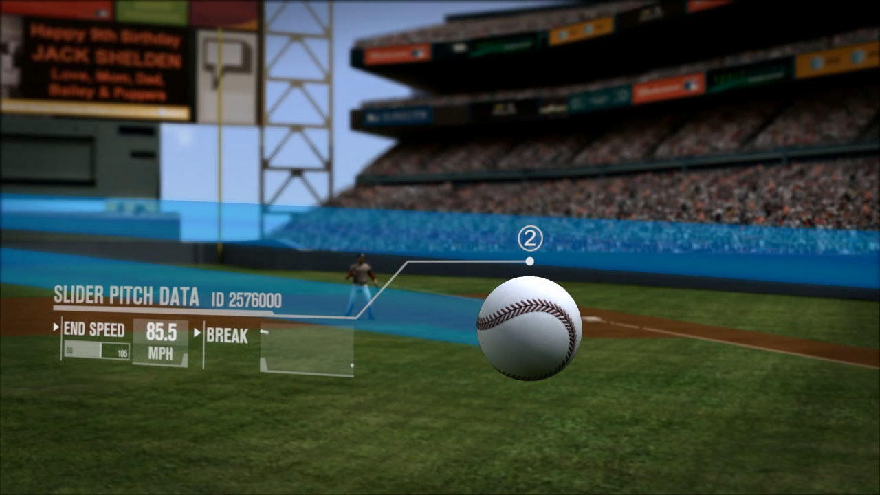
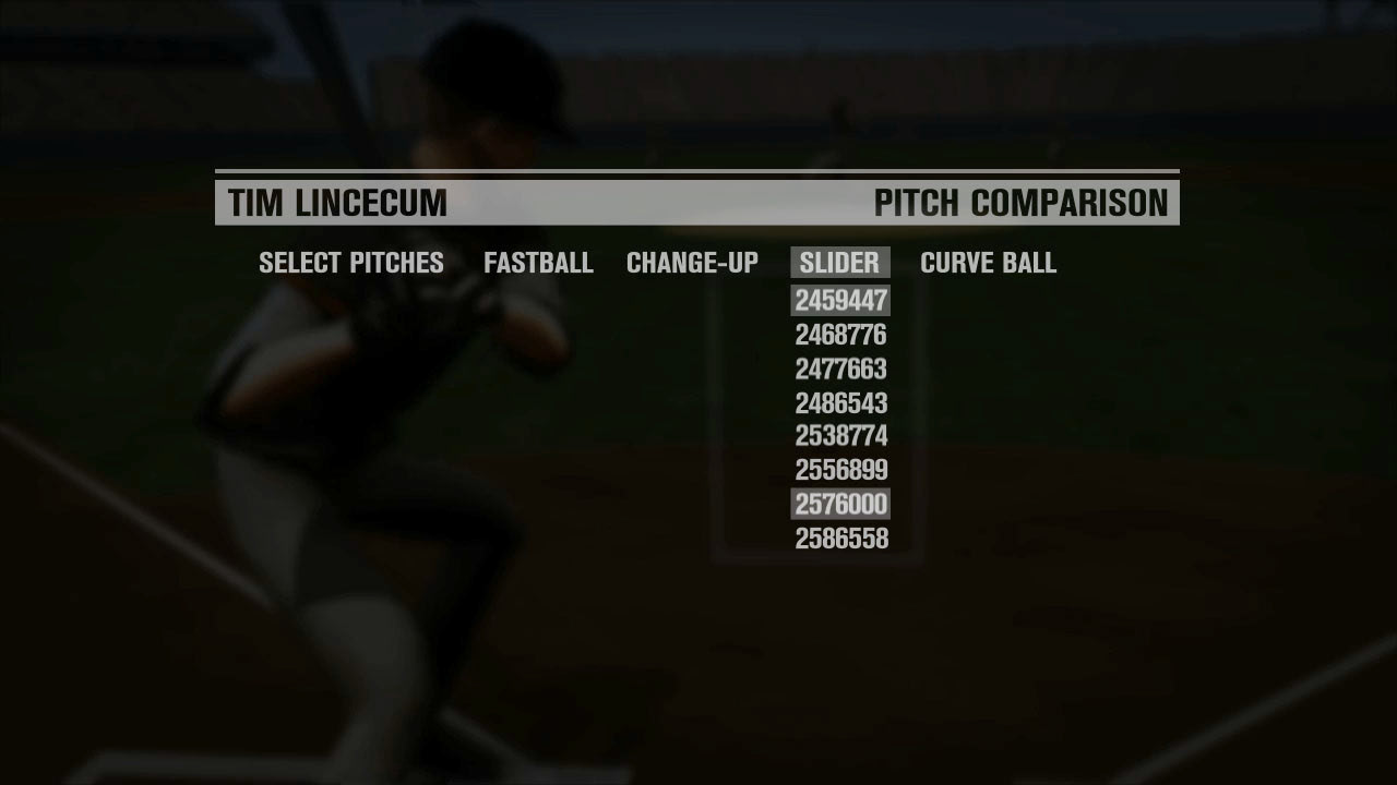
Pitchf/x Data Visualization
Tim Lincecum was going through a rough patch in 2010. Then in September he returned to form. His slider effectiveness was attributed to his turn-around. We took real data imported it into Maya and compared his average slider durning his slump and after to show the difference between using motion graphics to illustrate the data.